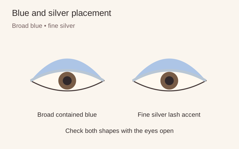
Blue and silver can look cool without covering the whole eye in sparkle. Give the blue the broad, soft area and the silver a narrow reflective edge. That difference in scale is the composition: one colour is a wash, the other a small interruption of light.
Pinterest’s 6 October 2026 report includes pastel blue shadow and silver liner. Here, a small silver accent gives the soft blue a clear boundary.
The three palette roles
Pastel blue occupies the upper lid. Silver sits close to the upper lashes in a fine line or short section. A quiet lip gives the eye room to remain the focal area. The fictional model’s pale blue has a soft sheen, with a silver edge that is easiest to see when she looks down. You can use matte blue if you want a clearer distinction between colour and reflection.
Build the broad shape first
Use a flat brush to place a small amount of blue on the mobile lid. Follow the product’s directions and work in light layers. Take a clean blending brush around the outer boundary without carrying blue all the way to the brow. Pause with the eyes open and your gaze straight ahead; that is the shape you will see most often.
If a crease folds over part of the colour, decide whether you want only a glimpse or a little more visible above it. Mark the upper edge while looking forward, then soften that boundary. For a monolid, choose a compact band or a slightly taller gradient according to what you want visible. Neither route requires copying another person’s crease or pulling the skin into a different shape.
Add the small reflection
With an eye-intended silver liner, make short connected marks along the external upper lash line. You can stop at the outer lashes; a wing is optional. If you use a shadow, follow its stated dry or damp application method rather than adding water to the pan by assumption. Keep the reflective width narrower than the blue area so the two colours retain different jobs.
Allow a setting formula to settle as its directions specify before opening fully. Check for transfer. If the line lands on the upper lid when you blink, make it thinner or choose a different placement next time. Covering the transferred mark with more silver usually makes the reflective area larger, which may not be the result you wanted.
Change depth without losing the idea
A very pale blue creates strong contrast on deeper skin and may look deliberately chalky. If that is not your preference, compare a richer cornflower or a more translucent blue. On a lighter complexion, a slightly deeper blue can distinguish the wash from the silver. These are options for contrast, not rules that restrict a colour to particular skin tones.
Keep tools clean and use only products intended for the eye area, in line with FDA eye-cosmetic guidance. Finish with mascara if wanted, then step away from the mirror. When the blue reads as a contained field and the silver as a fine accent, leave their proportions alone.
Makeup placement and colour are personal choices; adjust the steps to suit you. Follow the directions on your own products.