The useful decision is whether the visible area needs coverage, a colour adjustment, or neither. A corrector is not automatically the advanced version of concealer. Adding one gives you another layer to manage, so it should have a specific job that the existing concealer is not doing comfortably.
Bobbi Brown’s original Cassandra Garcia tutorial distinguishes a colour-correcting step from the skin-tone concealer placed over it. Use that distinction to make a smaller, individual comparison with the products you own.
Start with the outcome you want
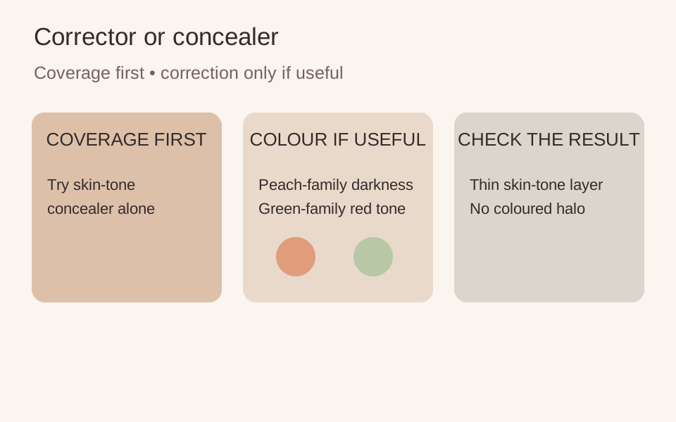
If a little skin-tone concealer gives you enough coverage, stop there. You do not need a corrector because one appears in someone else’s routine. If repeated concealer layers make the area look heavy while an unwanted hue still shows through, a small corrector comparison may be useful. That is a cosmetic observation, not a diagnosis of why the area has that colour.
| What you want | First comparison |
|---|---|
| Some evenness | A small amount of skin-tone concealer alone |
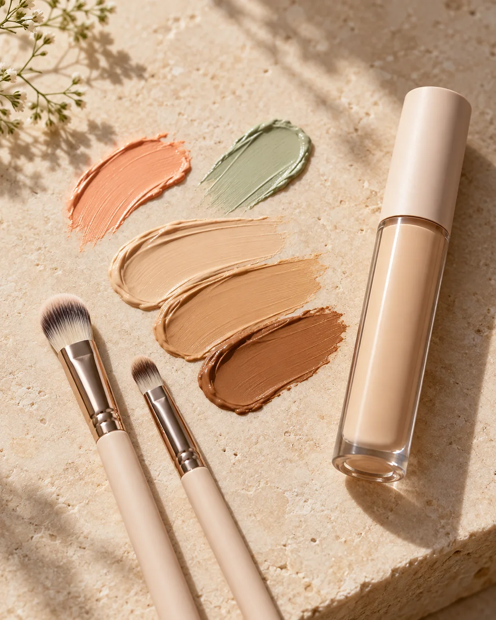
| Less visible cool darkness | A suitable peach, pink or orange-family corrector in an appropriate depth |
| Less visible red tone on comfortable intact skin | A small targeted green-family corrector, if wanted |
Choose depth alongside hue
A very pale corrector can leave a light cast on a deeper complexion; a rich orange may be too conspicuous under a sheer base on a lighter one. Compare the smallest useful amount against the actual area rather than choosing solely from a generic colour wheel. Natural pigmentation can vary across the face, so one shade may not do the same job everywhere.
Bobbi Brown’s tutorial uses peach and bisque families for different visible tones. e.l.f.’s manufacturer guide describes green as a targeted red-tone correction. Those are starting families, not universal shade prescriptions. Do not apply cosmetics to irritated or broken skin to hide a reaction, and do not interpret coverage as treatment.
Make a small layered comparison
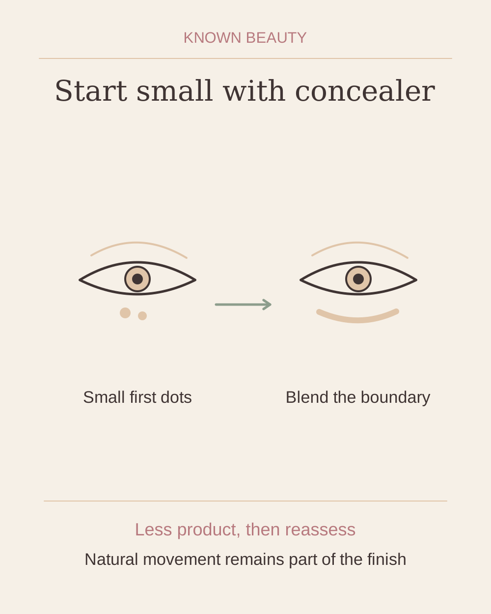
With a clean tool, place a thin amount only within the chosen patch. Soften the boundary without spreading a coloured halo beyond it. Let the formula settle as directed, then tap a small amount of skin-tone concealer or your usual compatible base over the top. Check in ordinary light before deciding whether more is needed.
Compare it with the result you get from concealer alone. Does the colour look more balanced with less coverage, or have you simply added a visible extra layer? If peach or green remains obvious, remove the excess and try less, another depth or no corrector. Covering a strong corrector with heavy concealer defeats the purpose of this particular comparison.
Keep only the step that earns its place
You may want correction for a particular occasion and skip it most days. You may also prefer your natural colour variation. Keep a corrector only if its small, local job makes your chosen finish easier to achieve. A full colour-correcting palette can wait until you can name more than one repeatable use.
Makeup placement and colour are personal choices; adjust the steps to suit you. Follow the directions on your own products.